Plotly is a powerful open-source graphing library that makes interactive, publication-quality graphs online. Unlike static visualization libraries, Plotly creates interactive charts that users can zoom, pan, and hover over to explore data in detail. In this guide, we’ll explore the fundamentals of Plotly and learn how to create beautiful, interactive visualizations in Python.
Table of Contents
Open Table of Contents
What is Plotly?
Plotly is a data visualization library that supports over 40 unique chart types, including scientific charts, 3D graphs, statistical charts, financial charts, maps, and more. It’s built on top of the open-source JavaScript library Plotly.js, making all charts interactive by default.
Key Features
- Interactivity: All charts are interactive with zoom, pan, hover tooltips, and click events
- Beautiful by default: Professional-looking charts with minimal configuration
- Web-based: Charts can be embedded in web applications, Jupyter notebooks, or saved as HTML
- Multiple APIs: Offers both high-level (Plotly Express) and low-level (Graph Objects) interfaces
- Wide language support: Available in Python, R, JavaScript, and other languages
- 3D visualization: Native support for 3D scatter plots, surface plots, and mesh plots
Installation
Plotly can be installed using pip or conda:
Installing via pip
# Basic installation
pip install plotly

# For use in Jupyter notebooks
pip install plotly nbformat

# For static image export (requires kaleido)
pip install kaleido
Installing with Conda
# Install from conda-forge
conda install -c plotly plotly

# For Jupyter Lab extension
conda install jupyterlab "ipywidgets>=7.5"
Verifying Installation
import plotly
print(plotly.__version__)
Plotly Express vs Graph Objects
Plotly offers two main interfaces for creating visualizations:
Plotly Express (High-Level API)
Plotly Express is a high-level interface designed for rapid visualization creation with minimal code. It’s perfect for exploratory data analysis and creating common chart types quickly.
import plotly.express as px

# Simple scatter plot in one line
fig = px.scatter(df, x='sepal_width', y='sepal_length', color='species')
fig.show()
Graph Objects (Low-Level API)
Graph Objects provides more granular control over every aspect of the visualization. Use this when you need custom layouts, complex interactions, or combining multiple chart types.
import plotly.graph_objects as go

# More control over chart elements
fig = go.Figure(data=go.Scatter(x=[1, 2, 3], y=[4, 5, 6]))
fig.update_layout(title='Custom Title', xaxis_title='X Axis')
fig.show()
When to use which?
- Plotly Express: Quick visualizations, standard chart types, exploratory analysis
- Graph Objects: Custom layouts, complex charts, maximum control
Basic Chart Types
Line Charts
Line charts are ideal for visualizing trends over time or continuous data.
import plotly.express as px
import pandas as pd

# Sample data
df = pd.DataFrame({
    'date': pd.date_range('2024-01-01', periods=100),
    'value': range(100),
    'category': ['A']*50 + ['B']*50
})

# Create line chart
fig = px.line(df, x='date', y='value', color='category',
              title='Time Series Data')
fig.show()
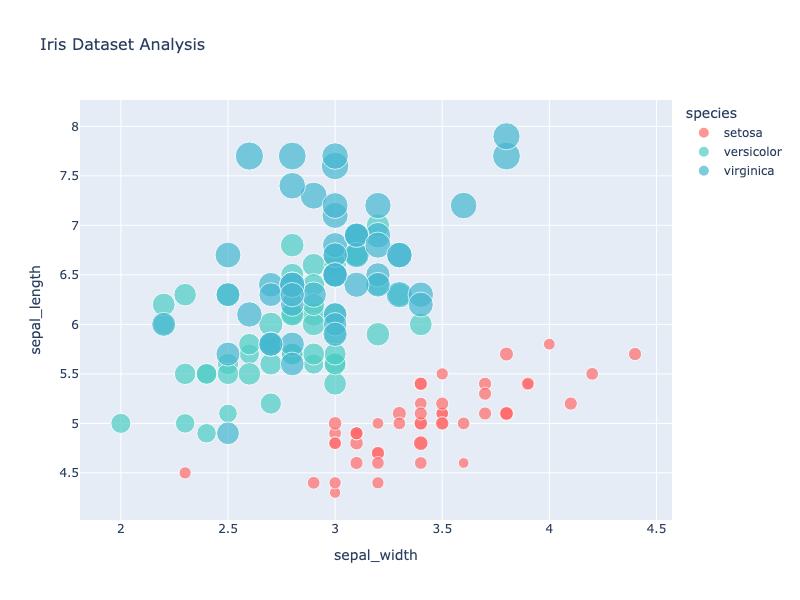
Scatter Plots
Scatter plots help visualize the relationship between two variables.
import plotly.express as px

# Using the iris dataset
df = px.data.iris()

fig = px.scatter(df, x='sepal_width', y='sepal_length',
                 color='species', size='petal_length',
                 hover_data=['petal_width'],
                 title='Iris Dataset Analysis')
fig.show()
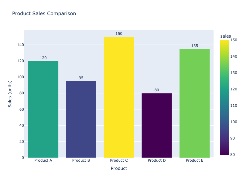
Bar Charts
Bar charts are excellent for comparing categorical data.
import plotly.express as px

# Sample data
data = {
    'product': ['Product A', 'Product B', 'Product C', 'Product D'],
    'sales': [120, 95, 150, 80]
}
df = pd.DataFrame(data)

# Vertical bar chart
fig = px.bar(df, x='product', y='sales',
             title='Product Sales Comparison',
             color='sales',
             color_continuous_scale='Viridis')
fig.show()

# Horizontal bar chart
fig = px.bar(df, x='sales', y='product', orientation='h',
             title='Product Sales (Horizontal)')
fig.show()
Histograms
Histograms show the distribution of numerical data.
import plotly.express as px
import numpy as np

# Generate random data
data = np.random.randn(1000)

fig = px.histogram(data, nbins=30,
                   title='Distribution of Random Data',
                   labels={'value': 'Values', 'count': 'Frequency'})
fig.show()
Box Plots
Box plots display the distribution of data based on quartiles.
import plotly.express as px

df = px.data.tips()

fig = px.box(df, x='day', y='total_bill', color='smoker',
             title='Restaurant Bills by Day and Smoking Status')
fig.show()
Pie Charts
Pie charts show the composition of categorical data.
import plotly.express as px

data = {
    'category': ['Category A', 'Category B', 'Category C', 'Category D'],
    'values': [30, 25, 20, 25]
}
df = pd.DataFrame(data)

fig = px.pie(df, values='values', names='category',
             title='Distribution by Category',
             hole=0.3)  # Creates a donut chart
fig.show()
Customization and Styling
Updating Layout
import plotly.express as px

df = px.data.iris()
fig = px.scatter(df, x='sepal_width', y='sepal_length')

# Customize layout
fig.update_layout(
    title='Customized Iris Dataset',
    title_font_size=24,
    title_font_color='navy',
    xaxis_title='Sepal Width (cm)',
    yaxis_title='Sepal Length (cm)',
    plot_bgcolor='lightgray',
    width=800,
    height=600,
    showlegend=True,
    legend=dict(
        orientation="h",
        yanchor="bottom",
        y=1.02,
        xanchor="right",
        x=1
    )
)
fig.show()
Custom Colors
import plotly.express as px

df = px.data.iris()

# Using custom color palette
fig = px.scatter(df, x='sepal_width', y='sepal_length', color='species',
                 color_discrete_map={
                     'setosa': '#FF6B6B',
                     'versicolor': '#4ECDC4',
                     'virginica': '#45B7D1'
                 })
fig.show()

# Using built-in color scales
fig = px.scatter(df, x='sepal_width', y='sepal_length',
                 color='petal_length',
                 color_continuous_scale='Viridis')
fig.show()
Markers and Lines
import plotly.graph_objects as go

fig = go.Figure()

fig.add_trace(go.Scatter(
    x=[1, 2, 3, 4],
    y=[10, 15, 13, 17],
    mode='markers+lines',
    marker=dict(
        size=12,
        color='red',
        symbol='diamond',
        line=dict(width=2, color='darkred')
    ),
    line=dict(
        color='blue',
        width=3,
        dash='dash'
    )
))

fig.update_layout(title='Custom Markers and Lines')
fig.show()
Subplots and Multiple Charts
Plotly makes it easy to create multiple charts in a single figure.
from plotly.subplots import make_subplots
import plotly.graph_objects as go

# Create 2x2 subplot grid
fig = make_subplots(
    rows=2, cols=2,
    subplot_titles=('Plot 1', 'Plot 2', 'Plot 3', 'Plot 4'),
    specs=[[{'type': 'scatter'}, {'type': 'bar'}],
           [{'type': 'scatter'}, {'type': 'box'}]]
)

# Add traces to different subplots
fig.add_trace(
    go.Scatter(x=[1, 2, 3], y=[4, 5, 6]),
    row=1, col=1
)

fig.add_trace(
    go.Bar(x=['A', 'B', 'C'], y=[10, 20, 15]),
    row=1, col=2
)

fig.add_trace(
    go.Scatter(x=[1, 2, 3], y=[2, 5, 3], mode='lines'),
    row=2, col=1
)

fig.add_trace(
    go.Box(y=[1, 2, 3, 4, 5, 6, 7, 8, 9]),
    row=2, col=2
)

fig.update_layout(height=600, showlegend=False, title_text="Multiple Subplots")
fig.show()
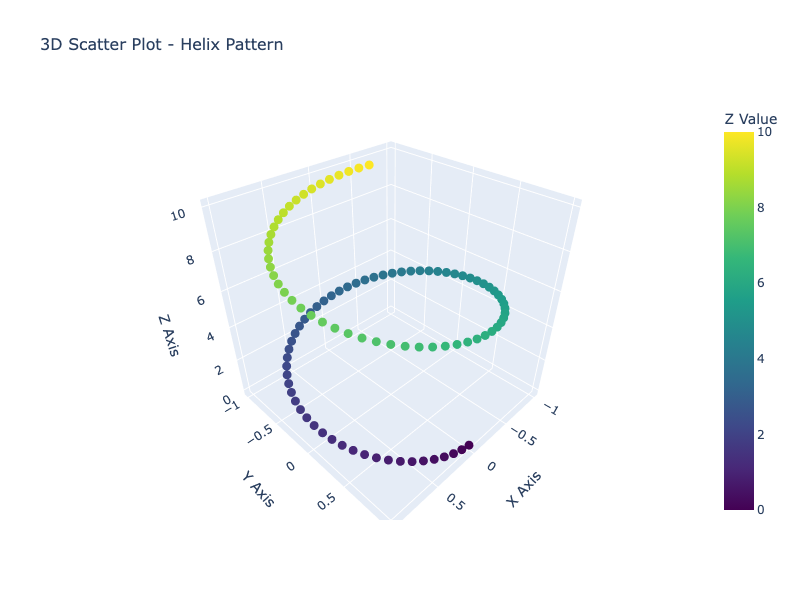
3D Visualizations
Plotly excels at creating interactive 3D visualizations.
import plotly.graph_objects as go
import numpy as np

# Generate 3D data
t = np.linspace(0, 10, 100)
x = np.sin(t)
y = np.cos(t)
z = t

# Create 3D scatter plot
fig = go.Figure(data=[go.Scatter3d(
    x=x, y=y, z=z,
    mode='markers',
    marker=dict(
        size=4,
        color=z,
        colorscale='Viridis',
        showscale=True
    )
)])

fig.update_layout(
    title='3D Scatter Plot',
    scene=dict(
        xaxis_title='X Axis',
        yaxis_title='Y Axis',
        zaxis_title='Z Axis'
    )
)
fig.show()
Exporting Visualizations
Save as HTML
import plotly.express as px

df = px.data.iris()
fig = px.scatter(df, x='sepal_width', y='sepal_length')

# Save as interactive HTML file
fig.write_html('plot.html')
Save as Static Image
# Requires kaleido: pip install kaleido

# Save as PNG
fig.write_image('plot.png', width=800, height=600)

# Save as PDF
fig.write_image('plot.pdf')

# Save as SVG
fig.write_image('plot.svg')
Display in Jupyter Notebook
# Default renderer
fig.show()

# Specify renderer
fig.show(renderer='notebook')
fig.show(renderer='browser')
Advanced Features
Interactive Animations
import plotly.express as px

df = px.data.gapminder()

fig = px.scatter(df, x='gdpPercap', y='lifeExp',
                 animation_frame='year',
                 animation_group='country',
                 size='pop', color='continent',
                 hover_name='country',
                 log_x=True,
                 size_max=60,
                 range_x=[100, 100000],
                 range_y=[25, 90])

fig.update_layout(title='Global Development Over Time')
fig.show()
Adding Annotations
import plotly.graph_objects as go

fig = go.Figure()

fig.add_trace(go.Scatter(
    x=[1, 2, 3, 4, 5],
    y=[1, 3, 2, 4, 3],
    mode='lines+markers'
))

# Add annotation
fig.add_annotation(
    x=3, y=2,
    text='Important Point',
    showarrow=True,
    arrowhead=2,
    arrowcolor='red',
    arrowsize=1,
    arrowwidth=2
)

fig.show()
Dropdown Menus
import plotly.graph_objects as go

fig = go.Figure()

# Add traces
fig.add_trace(go.Scatter(x=[1, 2, 3], y=[1, 2, 3], name='Linear'))
fig.add_trace(go.Scatter(x=[1, 2, 3], y=[1, 4, 9], name='Quadratic'))

# Add dropdown menu
fig.update_layout(
    updatemenus=[
        dict(
            buttons=list([
                dict(label='Linear',
                     method='update',
                     args=[{'visible': [True, False]}]),
                dict(label='Quadratic',
                     method='update',
                     args=[{'visible': [False, True]}]),
                dict(label='Both',
                     method='update',
                     args=[{'visible': [True, True]}])
            ]),
            direction='down',
            showactive=True,
        )
    ]
)

fig.show()
Best Practices
Performance Optimization
-
Use WebGL for large datasets: For scatter plots with >10,000 points
fig = go.Figure(data=go.Scattergl(x=x, y=y)) # Note: Scattergl instead of Scatter -
Reduce data points: Downsample when appropriate
df_sampled = df.sample(n=1000) # Random sample -
Use Plotly Express: Generally faster for standard charts
Accessibility
- Add descriptive titles and labels
- Use colorblind-friendly palettes
- Include alt text when exporting
- Ensure sufficient contrast
Code Organization
import plotly.express as px

def create_scatter_plot(df, x_col, y_col, color_col=None):
    """Create a standardized scatter plot"""
    fig = px.scatter(df, x=x_col, y=y_col, color=color_col)
    fig.update_layout(
        template='plotly_white',
        title_font_size=16,
        font=dict(family='Arial', size=12)
    )
    return fig

# Use the function
fig = create_scatter_plot(df, 'x_data', 'y_data', 'category')
fig.show()
Common Use Cases
Time Series Analysis
import plotly.express as px
import pandas as pd

# Stock price example
dates = pd.date_range('2024-01-01', periods=100)
prices = pd.Series(range(100)) + pd.Series(range(100)).apply(lambda x: x * 0.5)

df = pd.DataFrame({'date': dates, 'price': prices})

fig = px.line(df, x='date', y='price',
              title='Stock Price Over Time')
fig.update_xaxes(rangeslider_visible=True)
fig.show()
Statistical Distributions
import plotly.figure_factory as ff
import numpy as np

# Create distribution plot
data = [np.random.randn(200) + i for i in range(3)]
labels = ['Group A', 'Group B', 'Group C']

fig = ff.create_distplot(data, labels, bin_size=0.5)
fig.update_layout(title='Distribution Comparison')
fig.show()
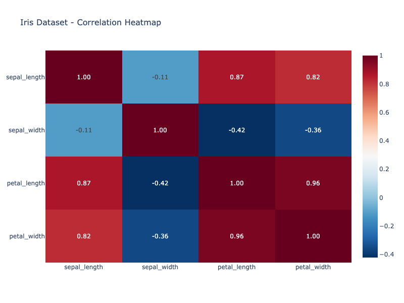
Correlation Heatmaps
import plotly.express as px

df = px.data.iris()
correlation = df.select_dtypes(include=['float64']).corr()

fig = px.imshow(correlation,
                text_auto=True,
                color_continuous_scale='RdBu_r',
                title='Correlation Heatmap')
fig.show()
Conclusion
Plotly is an incredibly versatile library that brings interactivity and beauty to data visualization in Python. Whether you’re creating simple charts with Plotly Express or building complex dashboards with Graph Objects, Plotly provides the tools you need for effective data communication.
Key Takeaways:
- Start with Plotly Express for rapid prototyping and common chart types
- Use Graph Objects when you need fine-grained control
- Leverage interactivity to make your data exploration more intuitive
- Combine with other tools like Dash for full web applications
- Export flexibly to HTML for sharing or static images for publications
With its comprehensive documentation, active community, and continuous development, Plotly has become an essential tool for data scientists, analysts, and developers working with data visualization in Python. The ability to create publication-quality interactive charts with minimal code makes it an excellent choice for both beginners and experienced practitioners.