Table of Contents
Open Table of Contents
A Comprehensive Guide to Matplotlib
Matplotlib is one of the most widely used libraries for creating static, animated, and interactive visualizations in Python. Its popularity stems from its versatility, extensive customization options, and seamless integration with other Python libraries like NumPy and Pandas. Whether you’re a beginner or an experienced developer, mastering Matplotlib can significantly enhance your data visualization skills. This tutorial will guide you through the basics, intermediate concepts, and advanced features of Matplotlib to help you create stunning and professional plots and graphs.
What is Matplotlib?
Matplotlib is a Python library used for creating a wide variety of plots. It allows users to generate line graphs, scatter plots, bar charts, histograms, pie charts, 3D plots, and much more with minimal effort. The library is highly customizable, offering control over every aspect of a plot, from colors and labels to gridlines and annotations, making it a popular choice for data analysis and visualization.
Matplotlib works seamlessly with other Python libraries like NumPy and Pandas, enabling smooth integration for handling and visualizing data efficiently. Its flexibility and versatility make it an indispensable tool for data scientists, engineers, and researchers.
Getting Started with Matplotlib
Installation
To start using Matplotlib, install it using pip:
pip install matplotlib
Alternatively, if you are working in a Jupyter Notebook, ensure you have Matplotlib installed within your environment. Many Python distributions, like Anaconda, come with Matplotlib pre-installed.
Importing Matplotlib
The most common way to import Matplotlib is:
import matplotlib.pyplot as plt
Here, plt is a widely used alias for the pyplot module, which provides an interface similar to MATLAB for creating plots. While pyplot handles most plotting needs, Matplotlib also includes advanced modules for customization and integration.
Basic Plotting with Matplotlib
Creating a Simple Line Plot
Here is how you can create a basic line plot: Line plots are commonly used to display data points connected by straight lines, making them ideal for visualizing trends or changes over a continuous interval, such as time.
import matplotlib.pyplot as plt

# Data for plotting
x = [1, 2, 3, 4, 5]
y = [2, 3, 5, 7, 11]

# Create the plot
plt.plot(x, y, label='Line Plot')

# Add labels and title
plt.xlabel('X-axis')
plt.ylabel('Y-axis')
plt.title('Simple Line Plot')

# Show the legend and plot
plt.legend()
plt.show()
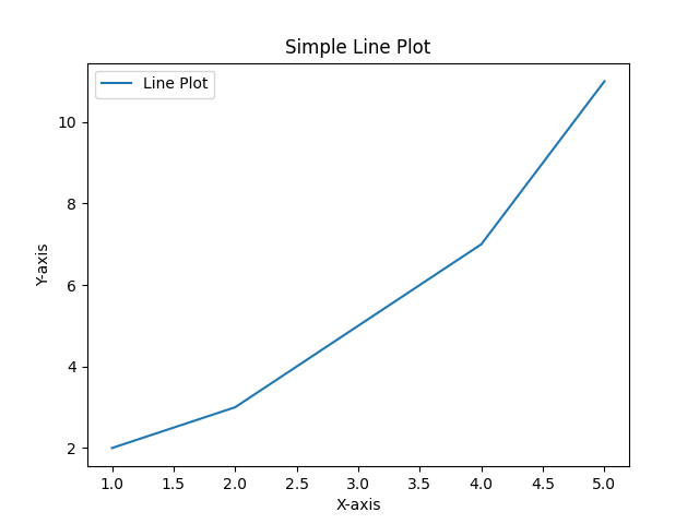
This simple example demonstrates how to create a plot, label axes, and add a legend. The plt.show() command ensures that the plot is displayed.
Overview of Chart Types
Matplotlib offers a wide range of chart types, each suited for specific data visualization needs. Here are some commonly used chart types:
- Line Charts: Ideal for showing trends over time or continuous data.
- Bar Charts: Used to compare quantities across categories. You can create vertical or horizontal bar charts using
plt.bar()orplt.barh(). - Scatter Plots: Best for visualizing relationships between two variables. Created using
plt.scatter(). - Histograms: Great for displaying the distribution of a dataset. Use
plt.hist()for this purpose. - Pie Charts: Useful for showing proportions of a whole. Use
plt.pie()to create pie charts. - Box Plots: Also known as whisker plots, these are used to show the distribution of data based on five summary statistics. Created using
plt.boxplot(). - Heatmaps: Used for representing data values across a matrix. While not directly part of Matplotlib, they can be created using libraries like Seaborn.
- 3D Charts: Matplotlib supports 3D plotting for surfaces, scatter plots, and line plots using the
Axes3Dmodule.
Each chart type can be customized with colors, labels, and styles to fit your data and presentation needs. Experiment with different types to find the best fit for your data.
Customizing Plots
Matplotlib allows extensive customization to enhance your plots:
- Colors and Line Styles: Change the color or style of the line.
plt.plot(x, y, color='red', linestyle='--')
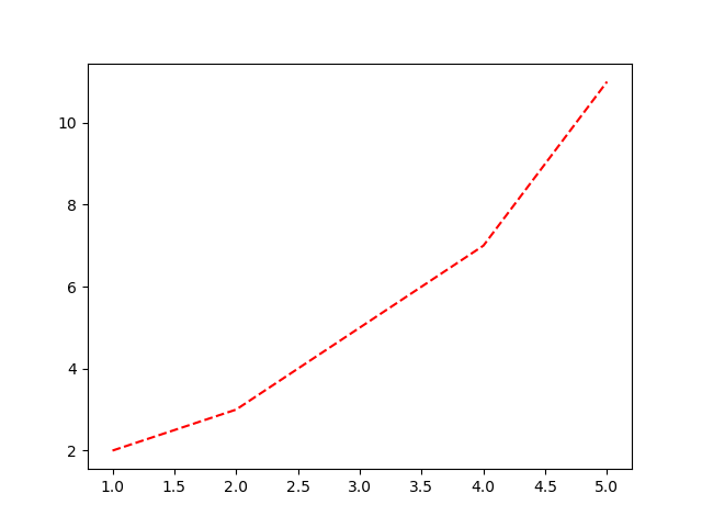
This example changes the line color to red and the line style to dashed.
- Markers: Add markers to highlight data points.
plt.plot(x, y, marker='o')
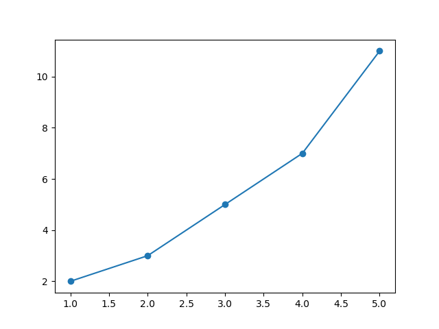
Here, the o marker is used to highlight data points.
- Gridlines: Add gridlines for better readability.
plt.grid(True)
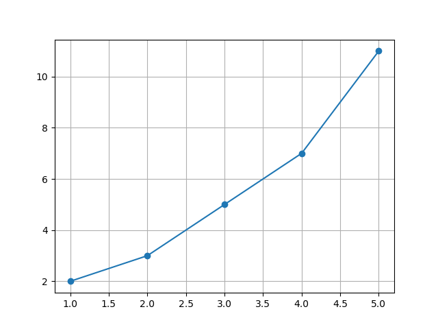
Gridlines can help viewers interpret the data more accurately.
Advanced Features
Subplots
You can create multiple plots in a single figure using subplots. Subplots are especially useful when comparing different data sets:
# Create subplots
fig, ax = plt.subplots(2, 1)

# First subplot
ax[0].plot(x, y, color='blue')
ax[0].set_title('First Plot')

# Second subplot
ax[1].plot(y, x, color='green')
ax[1].set_title('Second Plot')

# Adjust layout
plt.tight_layout()
plt.show()
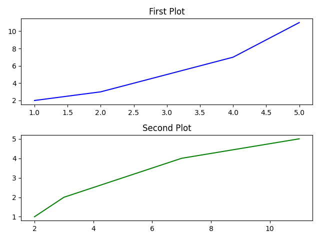
Here, fig represents the entire figure, while ax is an array of subplot axes. The tight_layout() function ensures proper spacing between subplots.
Working with Styles
Matplotlib comes with various styles to enhance your plots’ aesthetics. These styles can be used to quickly switch between pre-designed themes:
plt.style.use('dark_background')
plt.plot(x, y)
plt.show()
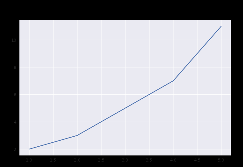
Other popular styles include seaborn, fivethirtyeight, and dark_background. Experimenting with different styles can make your visualizations more impactful.
Adding Annotations
Annotations can provide additional context to your plots:
plt.plot(x, y)
plt.annotate('Peak', xy=(5, 11), xytext=(3, 10),
             arrowprops=dict(facecolor='black', arrowstyle='->'))
plt.show()
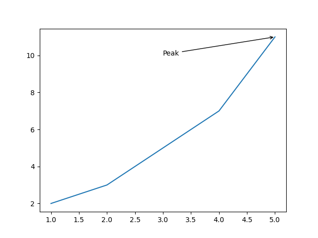
This example demonstrates how to highlight specific data points with text and arrows.
3D Plotting
Matplotlib also supports 3D visualizations. To use this feature, you need the Axes3D module:
from mpl_toolkits.mplot3d import Axes3D
import numpy as np

fig = plt.figure()
ax = fig.add_subplot(111, projection='3d')

# Data for plotting
x = np.linspace(-5, 5, 100)
y = np.linspace(-5, 5, 100)
X, Y = np.meshgrid(x, y)
Z = np.sin(np.sqrt(X**2 + Y**2))

# Create the surface plot
ax.plot_surface(X, Y, Z, cmap='viridis')
plt.show()
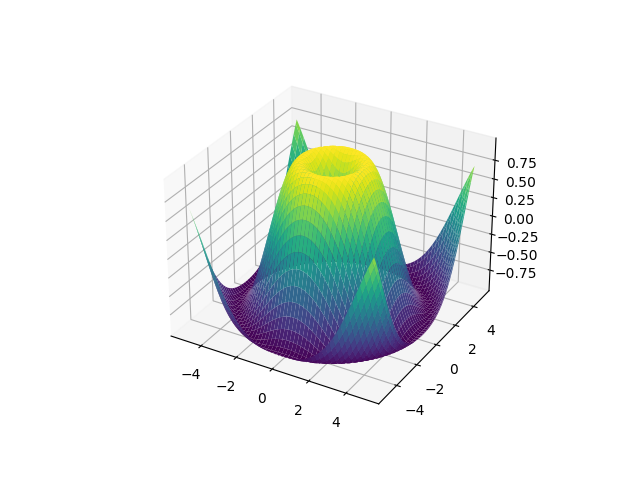
This example creates a 3D surface plot, showcasing Matplotlib’s advanced capabilities.
Saving Your Plots
Save your plots as image files using savefig. Matplotlib supports various formats, including PNG, JPEG, and PDF:
plt.savefig('plot.png', dpi=300, bbox_inches='tight')
The dpi parameter controls the resolution, and bbox_inches='tight' ensures no extra whitespace around the plot.
Conclusion
Matplotlib is an essential tool for anyone working with data visualization in Python. Its extensive features allow users to create everything from simple line plots to complex 3D visualizations. By mastering Matplotlib, you can communicate your data insights effectively and professionally. To deepen your understanding, consider exploring advanced tutorials, such as those focusing on animations or interactive plots with mpl_toolkits. Additionally, complementary libraries like Seaborn and Plotly can expand your data visualization toolkit. For official resources and detailed documentation, visit the Matplotlib documentation page at https://matplotlib.org/stable/contents.html. Take the time to explore different plot types, styles, and customization options to unlock its full potential.
Happy plotting!